What Athleisure Actually Looks Like in Photos - and Why It Surprises People

Quick Answer: Photographs flatten texture and exaggerate sheen, so matte fabrics with visible texture photograph better than smooth technical ones, and mid-tone colours hold detail better than very dark ones. The most common failure is a shiny performance fabric under indoor lighting, which reads as flat and plasticky. Structure at the shoulder and a defined waist survive the flattening; drapey oversized layers do not.
The mirror says the outfit is great. The photograph from dinner says something else entirely - flat, shapeless, oddly shiny in one spot. Both are accurate, because a camera and a mirror are doing genuinely different things.
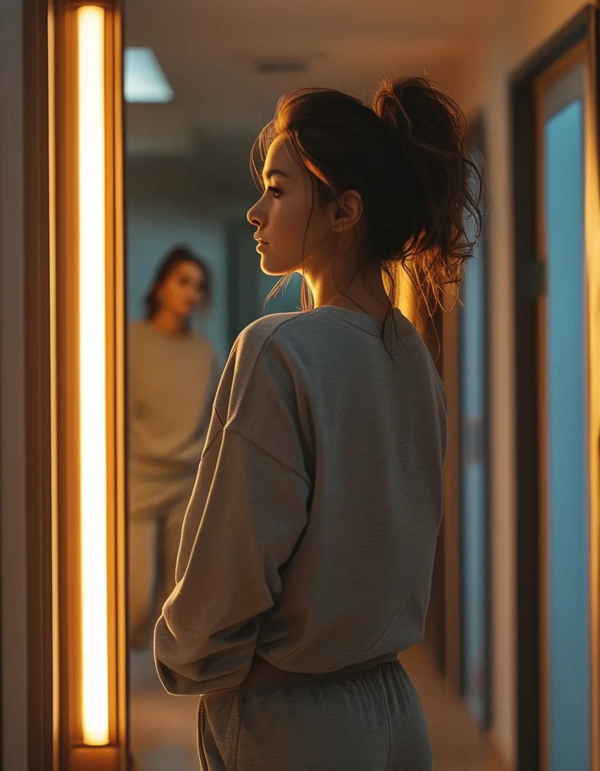
Why does an outfit look different in a photo?
Four transformations happen between standing in front of a mirror and looking at an image.
Three dimensions become two. A mirror shows depth - you can see that a jacket has structure, that a fabric has body, that there is space between the garment and your body. A photograph compresses all of that, so anything that relies on depth to read well loses most of its effect. Structure that is visible in outline survives; structure that is visible only in depth does not.
Light becomes fixed and directional. You see yourself in a mirror while moving slightly, under light that is usually reasonably even. A photograph is one instant under one lighting condition, frequently a harsh overhead one in restaurants. Overhead light creates shadows under the brow, the bust, and any horizontal seam, and it makes any sheen on fabric flare.
Colour shifts. Camera white balance interprets the scene and shifts every colour accordingly. Warm restaurant light makes cool tones look muddy; phone processing typically increases contrast and saturation, which deepens dark colours into detail-free blocks.
Texture flattens. This is the one people notice least and it matters most. A ribbed knit, a waffle texture, a brushed fleece - all read clearly to the eye and only partially to a camera. Smooth fabric, which already has little to show, becomes a flat area of colour.
The practical consequence: photographs reward outline, contrast, and texture that is strong enough to survive flattening, and punish subtlety.
Which fabrics photograph well and which do not?
Sheen is the dividing line.
Photographs well:
- Matte, textured knits - ribbed, waffle, brushed, cable, bouclé. Texture that is bold enough to register after flattening adds visual interest that smooth fabric cannot.
- Ponte and scuba-type fabrics with body. They hold structure, which reads as shape in outline.
- Matte technical fabric - the newer buttery-matte finishes rather than the shiny ones.
- Denim, and denim-look fabrics. Texture plus matte finish plus familiar visual reference.
- Wool and wool blends, which have a soft light diffusion that reads well.
Photographs poorly:
- High-sheen performance fabric. Shiny lycra, glossy compression, anything with a wet-look finish. Under a point light source this produces a hard specular highlight that reads as cheap regardless of what it cost.
- Very thin drapey jersey. Clings without structure, and shows every underlying line in a way that is much more visible in a still image than in motion.
- Anything with a slight metallic thread under artificial light, which flares unpredictably.
- Pure black in low light. The camera has no detail to record, so it becomes a silhouette. Charcoal, deep navy, and dark olive keep detail where black loses it.
And the practical test: take a photo of the outfit under the type of light you will actually be in - not bathroom light, not daylight by the window. It takes ten seconds and it is the only reliable check.
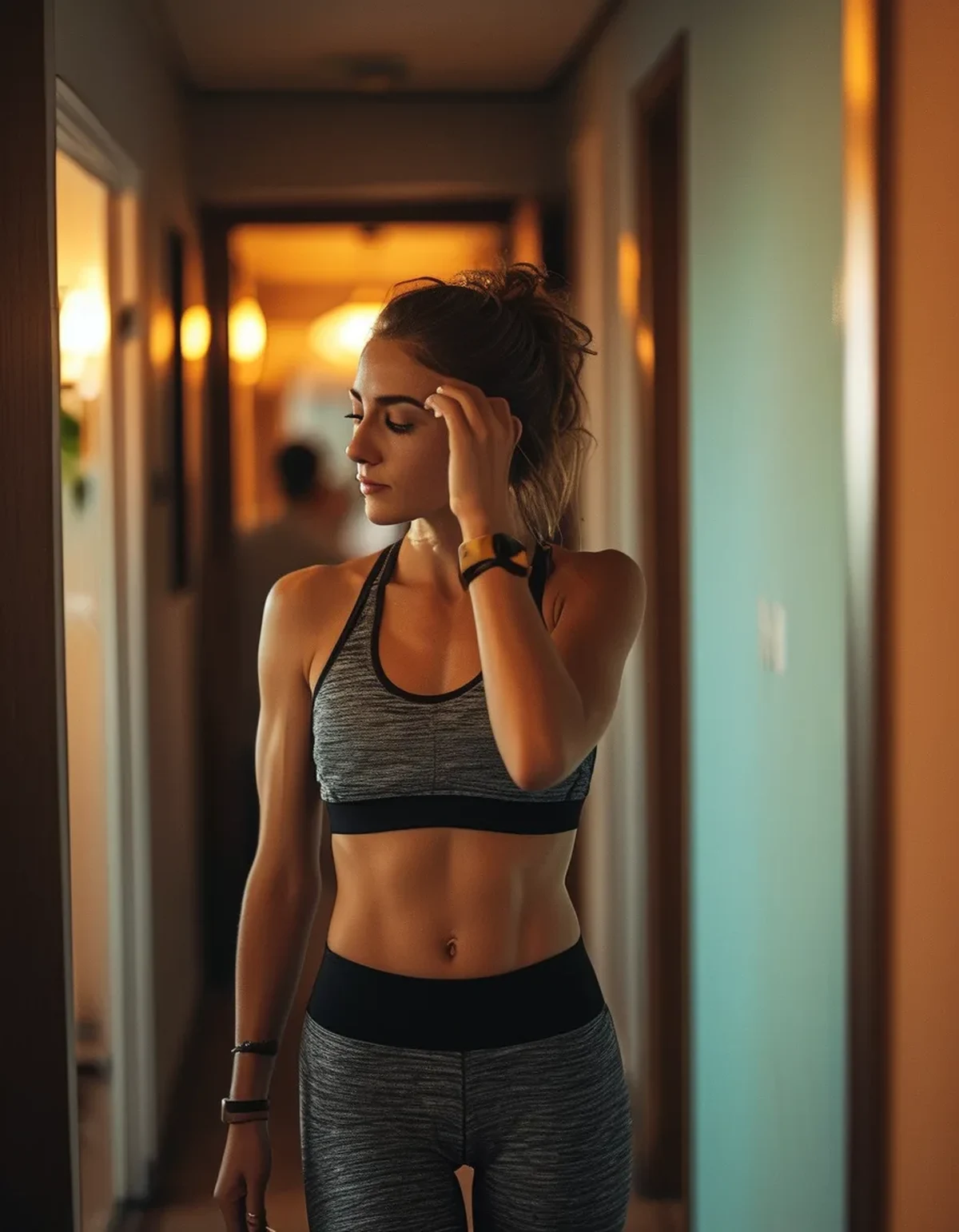
What Nobody Tells You About Photographing Well in Athleisure
Structure at the shoulder does more than anything else. A defined shoulder line - a jacket, a structured knit, even a sleeve with some body - gives the image an outline to read. Without it, the top half becomes an undifferentiated shape. This is why a blazer over leggings photographs so much better than the same leggings with a soft hoodie, even when the hoodie looks better in person.
A visible waist is worth more than a flattering fit. In two dimensions, the eye reads the outline. A defined waist - through a tucked layer, a belt, a cropped top, or a jacket that nips in - creates the outline. A perfectly fitted but straight-through-the-body outfit reads as a rectangle.
Very dark outfits lose all detail in restaurant lighting. The whole outfit merges into one shape and the only visible thing is your face and hands. Adding one lighter element - a cream layer, a light shoe, a lighter bag - gives the image structure and separates you from a dark background.
Mid-tones photograph better than extremes. Very light can blow out under flash; very dark loses detail. Mid-tone colours retain the most information across the widest range of lighting.
And the fabric that gets a compliment in person is often the one that fails on camera. Buttery-soft high-sheen fabric feels expensive and reflects light in a hard, bright way that flattens. It is genuinely a case where the in-person experience and the photographic result diverge - which is worth knowing before you conclude the photo means the outfit was wrong.
How do you build an outfit that works both ways?
Three decisions cover most of it.
Decide the one structured piece. A blazer, a well-cut denim jacket, a structured knit, or a trench. One piece with genuine shoulder structure carries the entire image. Everything else can be soft.
Choose matte over shiny in the largest area. Whatever piece occupies the most visual space - usually the trousers or leggings - should be matte and mid-weight. Save any sheen for a small element: a shoe, a bag, a small detail. Sheen in a small area reads as a deliberate accent; sheen across the legs reads as gym kit under a restaurant light.
Introduce one tonal break. A lighter or contrasting element somewhere - a cream layer, a light shoe, a scarf - so the outfit is not one continuous block. This is what gives a photograph something to read.
A concrete example for a late-August evening:
- Matte black or charcoal wide-leg technical trousers or a ponte legging.
- A fitted ribbed knit top in cream or a mid-tone, tucked at the front.
- A structured denim or lightweight blazer, which handles the temperature drop after sunset.
- A leather or leather-look shoe with some sheen - the small accent.
- A defined waist created by the tuck, not by a belt you have to think about.
And the last check: stand where you will be standing, ask someone to take one photo, and look at it. Not to judge yourself - to see whether the outfit is doing what you think it is doing. Ninety seconds of information beats an evening of wondering.
FAQ: Athleisure and Photos Questions, Answered
Why does my athleisure look bad in photos but fine in the mirror?
A mirror shows depth and even light; a photo flattens the outfit to two dimensions under one fixed light source. Anything relying on drape, subtlety, or texture too fine to register loses its effect, and any sheen flares.
What colours photograph best for evening out?
Mid-tones - charcoal, deep olive, warm taupe, navy - keep the most detail across varied lighting. Pure black loses all detail in dim restaurant light; very light colours can blow out under flash.
Should I avoid shiny activewear fabric for date night?
In large areas, yes. High-sheen fabric under a point light source produces hard specular highlights that read as flat and cheap. Confine sheen to a small accent like a shoe or bag.
How do I look less shapeless in photos?
Add structure at the shoulder and definition at the waist. In two dimensions the eye reads outline, so a blazer or structured layer plus a front tuck or cropped top does more than any amount of fabric quality.
TL;DR:
- Photos flatten depth and exaggerate sheen, which is why matte and textured wins.
- One structured shoulder piece carries the whole image.
- Mid-tones hold detail; pure black disappears in restaurant lighting.
- Confine any shine to a small accent rather than the largest area.
- Take one test photo in the actual lighting - it settles the question in ten seconds.
The outfit was probably fine. The camera just has opinions about fabric that mirrors do not.
See It in Motion
Seen here: High Waist 8” Yoga Shorts — shop similar styles on bubblelime.com
Keep Reading
This article is for general informational and styling purposes only. Fit, sizing, and product availability may vary.